Nick Searle
3D Artist, Designer
SelectTV Sales Site - Aqua Refresh
About The App
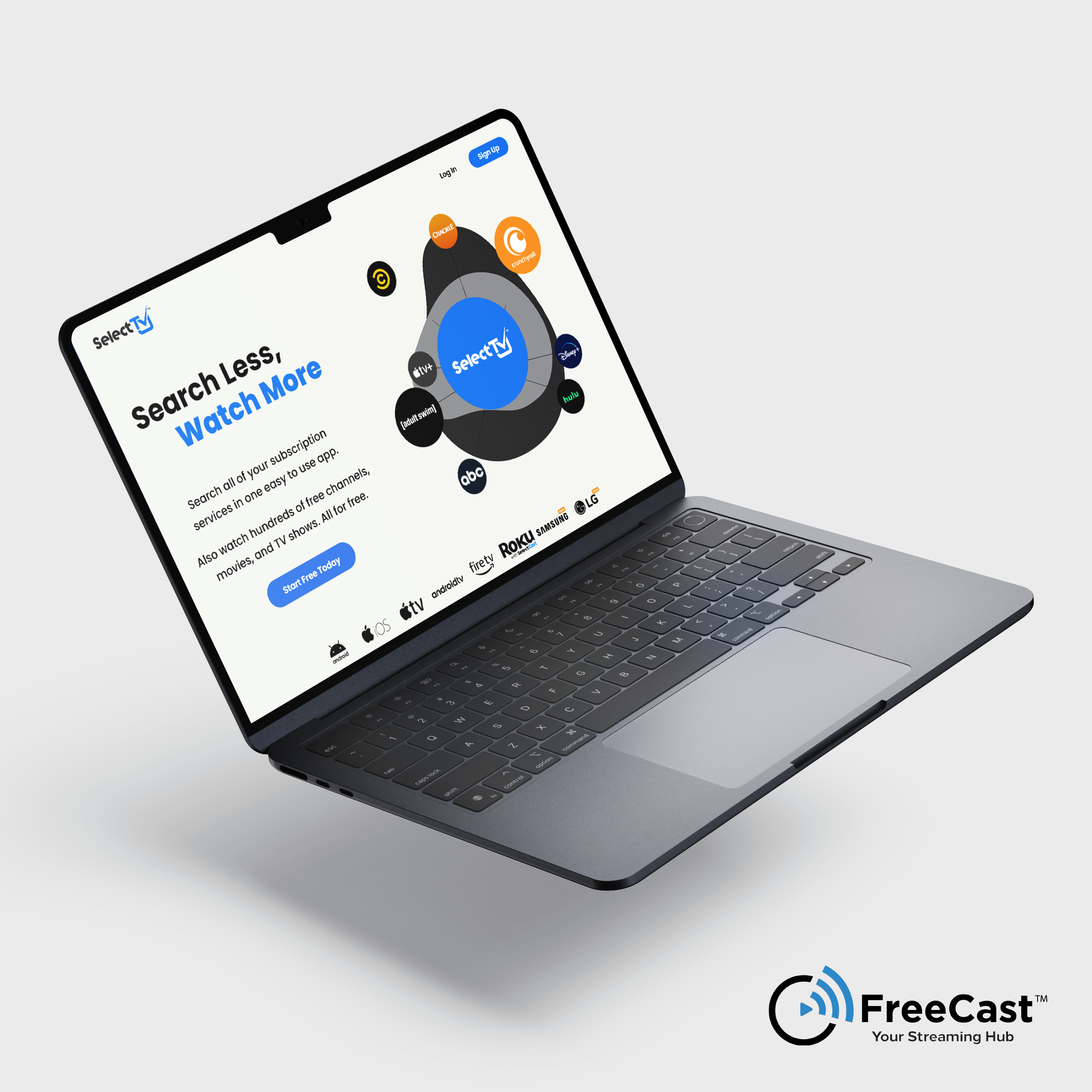
FreeCast (formerly known as SelectTV) is an application that combines FAST Channels, an extensive VOD/AVOD library, and a search engine that allows users to search for and find content within the libraries of other streaming applications, such as Netflix, Hulu, Amazon Prime Video, and more. It aims to be a single application to house all of the entertainment needed by users of streaming content by collecting and organizing it in one easy-to-use system.
Brief
As user count began to increase, FreeCast aimed to revamp it’s aging Sales Site to encourage more users to sign up upon reaching the landing page. We were showing a significant amount of bounce at the time, where users would be directed to the site from outside, but would leave without taking any action. Our goal was to revamp the sales site to be more user friendly, better present information, and drive new registration.
Adding Life Above the Fold
One of the first things we knew we wanted to do as a team was eliminate the static assets that currently occupied this space. We needed life, dynamism, motion. We sought help from our on-staff video professional, who had some significant experience in After Effects and was able to produce this very lively procedural animation for us. The animation, originally conceived by Kloe, our UX Researcher, was intended to show that SelectTV was more than just a streaming application: it pulled in all of the other streaming apps around it to become a centrifuge for entertainment.
The Aqua Stream
SelectTV has, is, and always will be about delivering the largest online library of streamable content in the world to as many users as possible. It aims to be an easy, accessible way for consumers to find the entertainment they are looking for in an ever-expanding, increasingly complex digital landscape.
When we redesigned the SelectTV sales site, we wanted to bring in a literal aspect of streaming, a visual element that would bring the user back to this core concept.
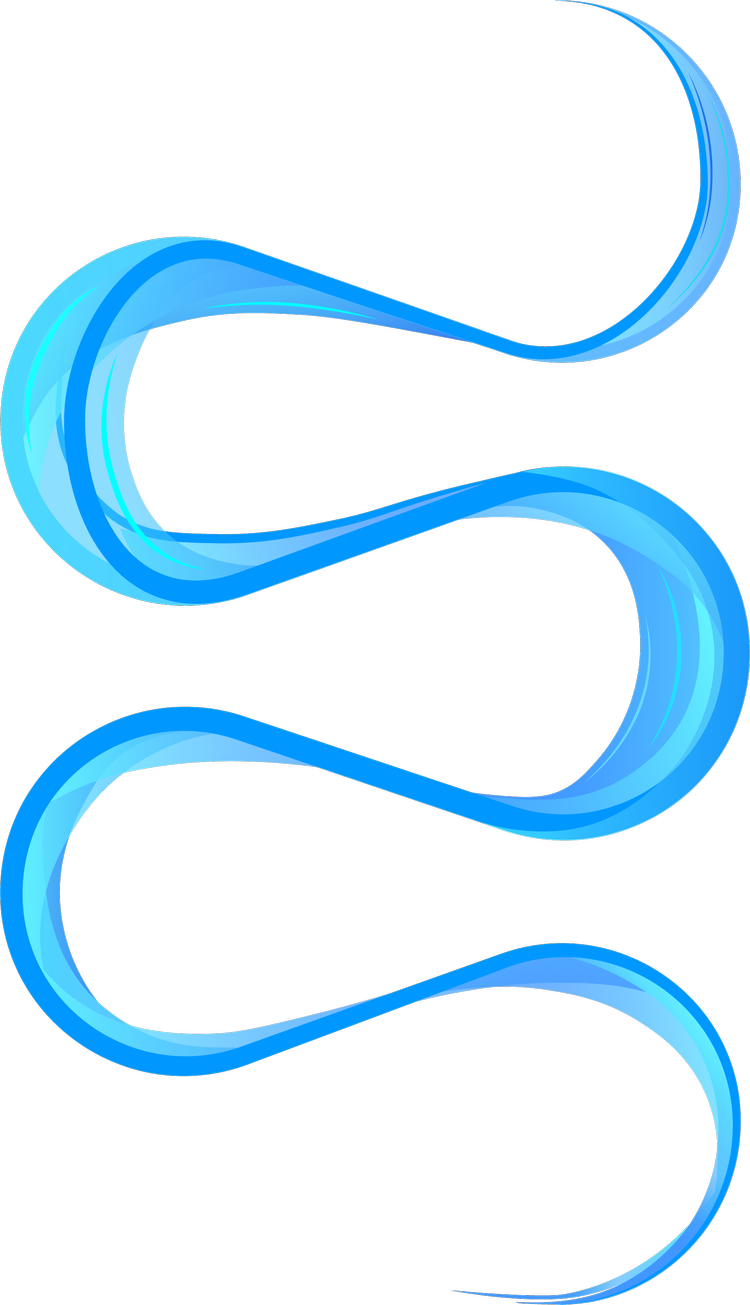
After our UX Designer provided the wireframes, I started drawing a line through the expected flow for the user; where we wanted them to go, how the information was presented. This was how we ended up with Aqua.
This ribbon formed the core of the design, guiding the user through the marketing touchpoints and product features, all while leading them to one, finite solution: “Start Watching”.
Real Reviews
It is true that a recommendation from a friend is more powerful than any marketing campaign. What we found that was much more interesting was that written reviews and testimonials were almost just as powerful, and we decided to harness that power. Some sites generate fake reviews, but being a member of the Dev team, I had access to the real thing. We decided to feature true reviews from our users as a hook to pull in any users that weren’t sold by the contents of the primary flow, re-affirming any uncertainties with testimonials from others that took the plunge.
At this point, why not signup? It’s free!
The Prototype
I’ve included a link to view the final prototype here. Feel free to take a look at the finished result.
Credits
I worked with several incredibly talented people to deliver this project, and I would not have been able to accomplish it without them. If you are in need of dedicated, talented people for roles other than mine, I earnestly recommend each and every one of these wonderful professionals.
Matt Owens
Full Stack Web Developer
Matt is the necromancer developer responsible for transforming our design into something users could experience. He served as the bridge between concept and completion and provided key technical insight to prevent creativity from inflating the project’s scope and timeline.
Alex Krull
Scrum Master
Alex is an expert in rooting out the causes of problems and ensuring interpersonal cohesion in the teams he works with. He is able to calmly mediate between business executives and staff to deliver results, while remaining a relatable and open human being.
Evan Rehyansky
Video Production/Editing
Evan is a video editor by profession, but stepped up to learn how to create animations using Lottie. He’s responsible for bringing our hero art to life, and we would have never been able to execute on our vision without his willingness to help and his expertise.
Kloe Zajac
UX Researcher
Kloe provided the original wireframes for the project. Her research and insights helped us guide the project back when our creative-heavy approaches led us away from what users needed, and produced a final result that provided the best possible experience.


